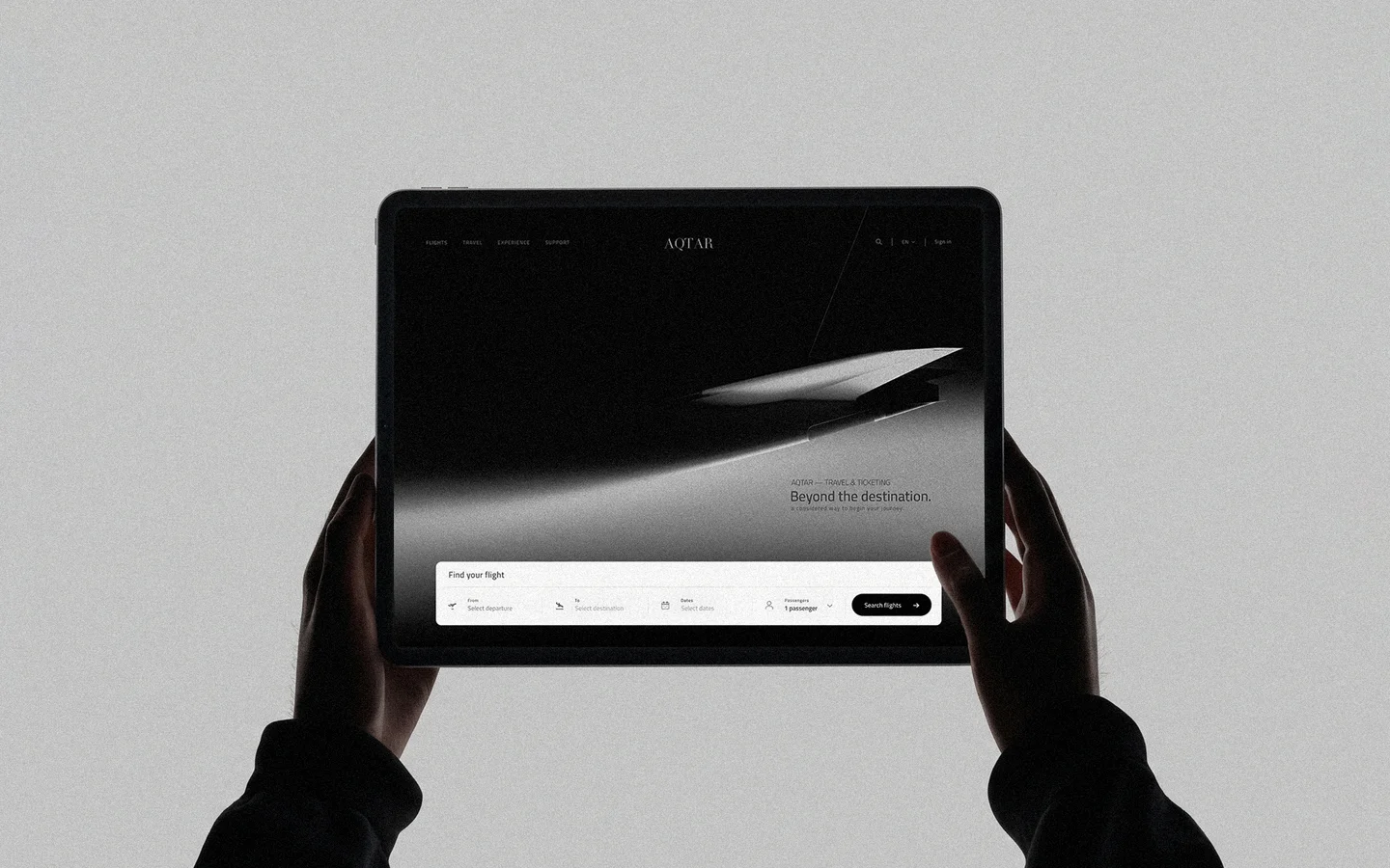
02 / Selected Work Travel & Ticketing
A visual identity for a travel and ticketing business, bringing clarity and character to the anticipation of departure.
- Sector
- Travel & Ticketing
- Design scope
- Brand Identity / Print / Company Profile / Logo Motion / Digital Concept
- Explorations
- Initial profile design, logo motion and a website concept

Every journey begins before departure.
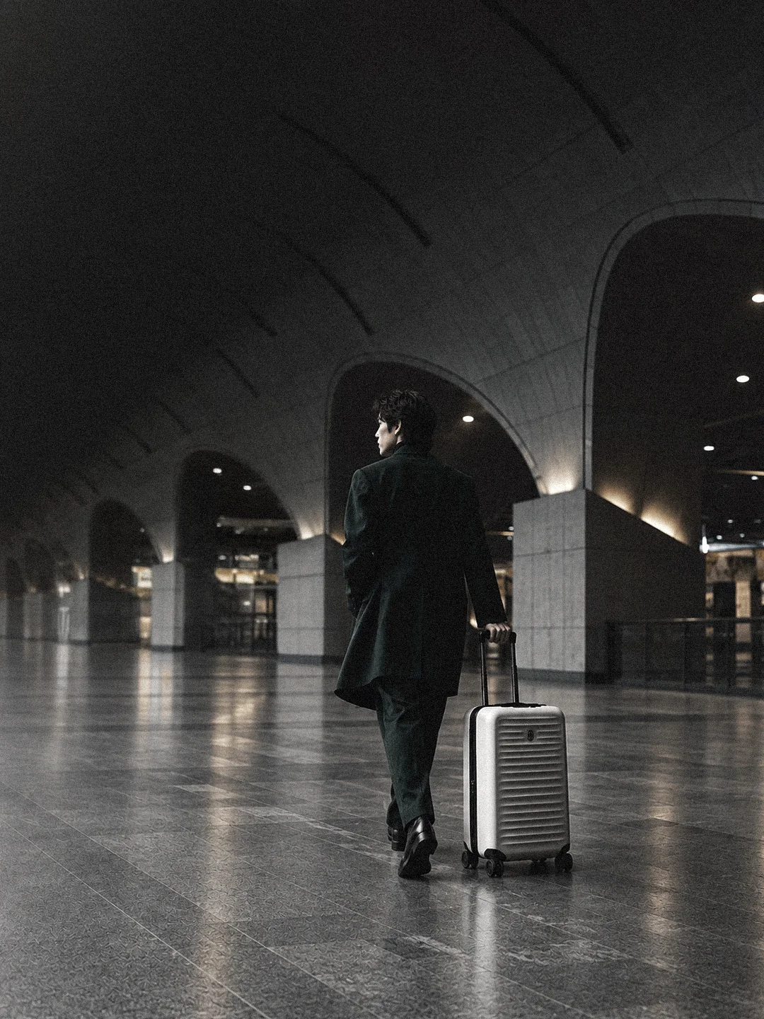
The folded shirt. The packed case. The passage through a terminal. These quiet rituals set the visual tone: personal moments held against a larger sense of possibility.

Movement,
given form.
Aviation offers a precise visual vocabulary: diagonal lines, open space and decisive contrast. The image direction connects that vocabulary to the scale of personal travel.

An identity
made tangible.
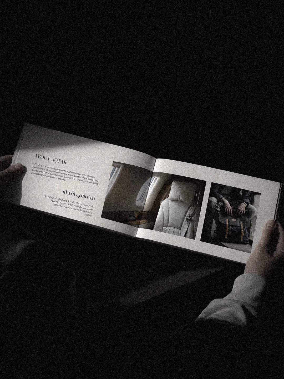
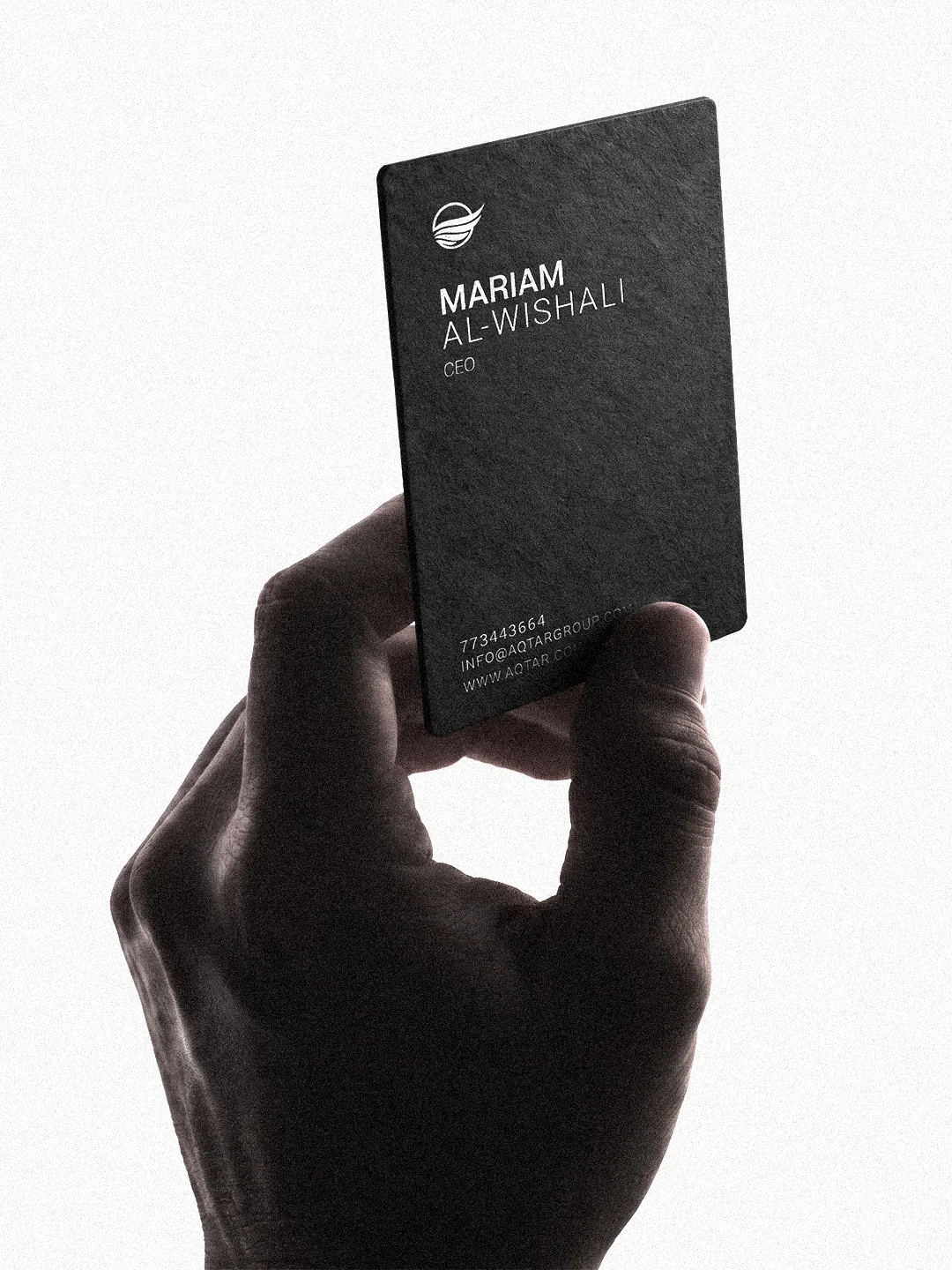
The wordmark and symbol take on a practical role in business cards and selected print applications. Initial company-profile layouts bring typography, photography and information into a measured editorial structure.
Beyond the
printed form.
A website concept explores how the visual language could support a considered travel-booking interface. Atmospheric imagery gives way to clear search controls and a restrained information hierarchy.Concept design / Not a launched booking platform.